Highlights
Project Overview
This project focused on redesigning AI Drona, an EdTech platform, to cater to a younger audience—students in grades 3 to 8. The aim was to shift the user base from older to younger kids by creating a UI tailored to their needs, making it fun, engaging, and easy to use while supporting their learning journey.
Challenge
The main challenge was designing an engaging, age-appropriate experience for students in grades 3 to 8 while maintaining the app's existing structure and functionality.
Opportunity
This project provided the opportunity to explore how design can make learning fun for younger users, and it helped me understand the importance of balancing playful elements with clear, easy-to-use functionality.
Timeline
2 Month
Disciplines
User Experience Design
User Interface Design
Responsibilities
UX Research
Design Thinking
Wireframing
Prototyping
Tools
Figma
Notion
ChatGPT
Skip to Designs
Background
Introduction
AI Drona, an EdTech platform, needed a redesign to cater to students in grades 3 to 8. The goal was to make the platform more engaging, fun, and user-friendly while keeping it educational. Key features like gamification and simplified navigation were added to enhance the learning experience for younger users.
Key Challenges
Maintaining the existing flow: A major challenge was to retain the original user flow to minimize development time while redesigning the platform for younger children.
Engaging younger learners: The task was to create a playful, intuitive design that made learning fun and interactive without overwhelming young users.
My Process
1
Research
Desk Research
Competitive Analysis
2
Synthesis
Old UI Issue
3
Designs
High Fidelity
Major Improvements
4
Reflection
Learning
Research
Desk Research
I conducted desk research to understand the preferences of children aged 8 to 14 and how design can support their growing skills. Key findings showed they prefer engaging designs with clear symbols, a sense of community, calm colors, and personalization. These insights shaped a vibrant, user-friendly design tailored for young learners.
Key Findings:
Children aged 8-14 enjoy interactive and engaging designs.
Calm, cool colors work best, with customizable elements to reflect mood or preferences.
Use simple icons and illustration that are easy to understand.
Gender-neutral colors and graphics are important for broad appeal.
Storytelling and rewards play a key role in keeping children engaged.
Competitor Analysis: IXL Learning
Analyzing IXL Learning revealed that a clean, structured layout with colorful visuals and clear learning paths works well for young users. The platform effectively uses gamification, rewards, and progress tracking to motivate students. However, there’s room for more interactivity and customization to better engage children and let them express their creativity.

Key Insights:
Clear layout and easy navigation are key for younger users.
Gamification and rewards motivate students effectively.
More interactive and customizable elements could improve engagement.
A balance of education and fun design is essential.
Synthesis
Old UI Issue
I reviewed the existing design to identify areas for improvement, focusing on how it could better engage younger users. The current design lacked visual appeal and clarity, making the experience overwhelming. Here are the key findings:

Course Selection Screen
Lack of engaging visuals and illustrations, making the screen feel cluttered.
The layout is text-heavy, reducing visual appeal for younger users.
Needs more interactive and colorful elements to capture attention.
Dashboard Screen
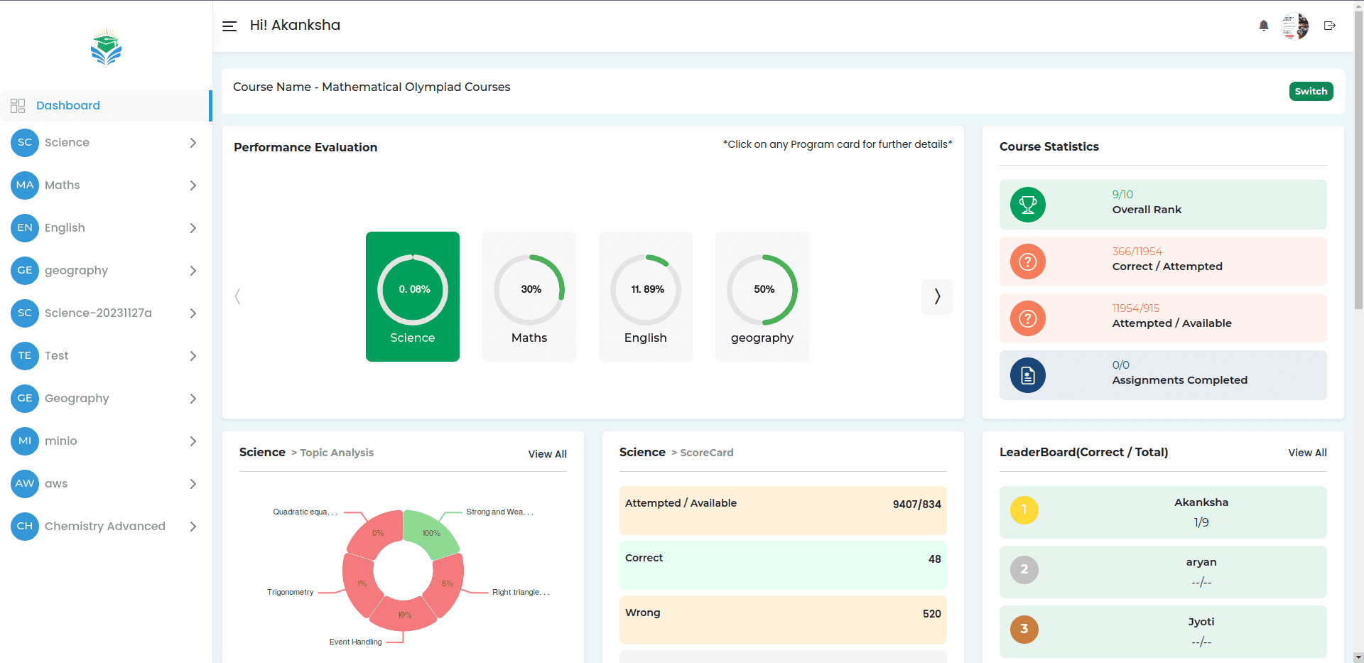
Overwhelming data presentation, too much information for younger users to process.
The use of text-heavy statistics without visual cues makes it difficult to interpret.
Could benefit from more vibrant colors and illustrations to make the data more engaging and understandable.
Design
High Fidelity
The final designs were all about making the platform fun, engaging, and easy for young students to use. I focused on adding vibrant visuals, gamification elements, and a smoother navigation experience.
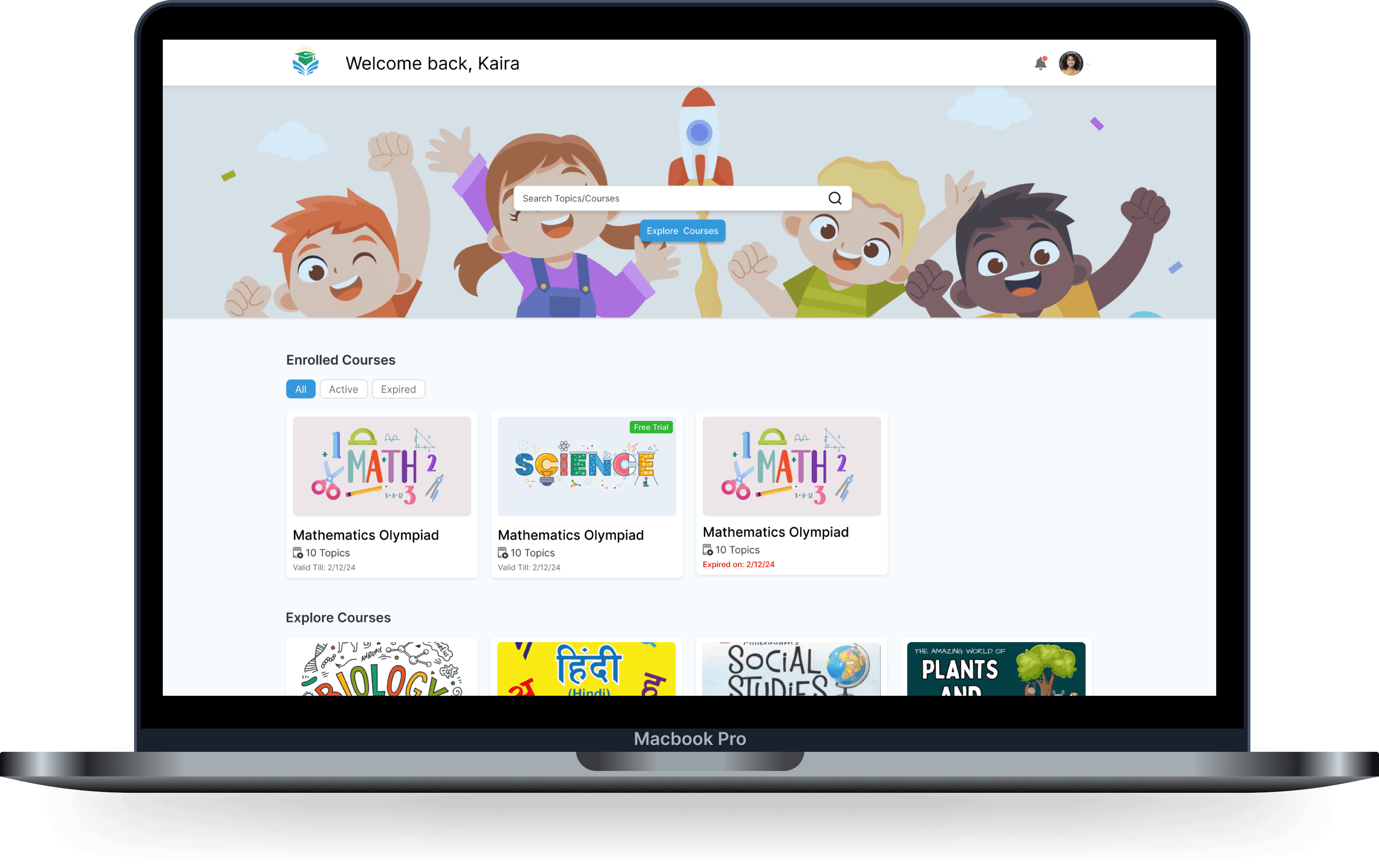
Course Selection Screen
Dashboard Screen
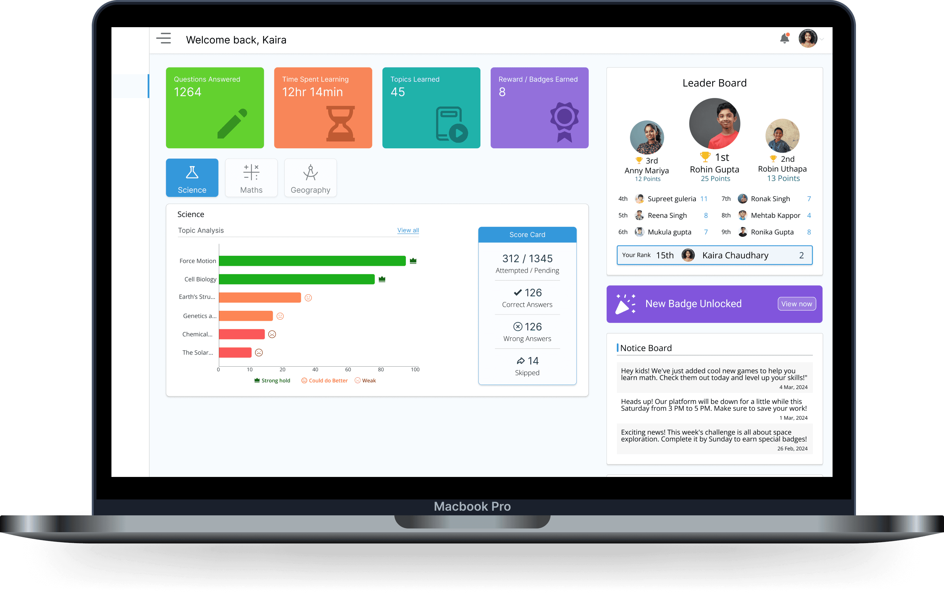
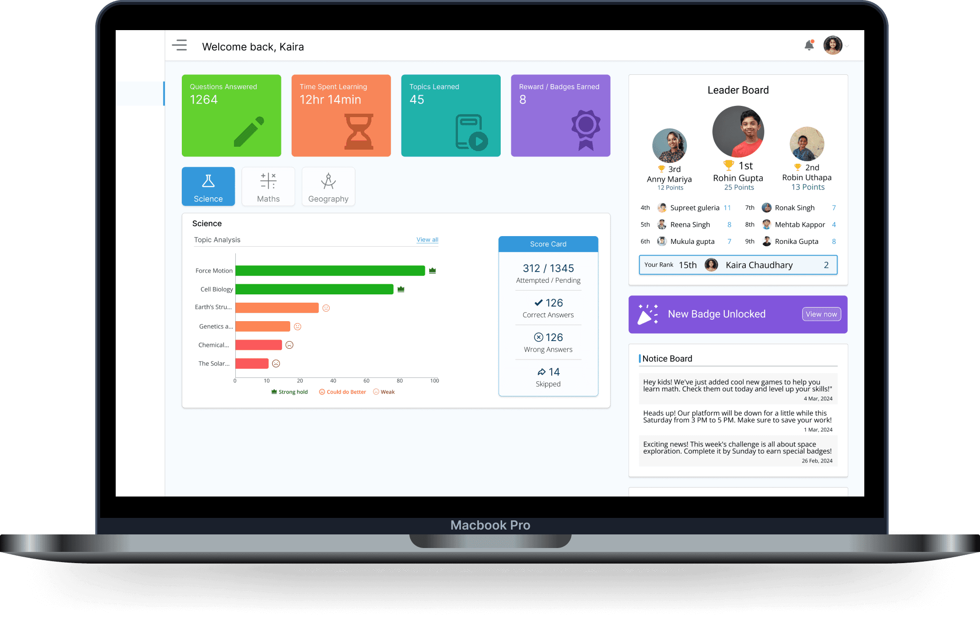
Major Ui Improvements (Dashboard Screen)
This section highlights the key updates made to the dashboard to make it more engaging, colorful, and user-friendly for younger students. The improvements focused on enhancing clarity, boosting motivation, and providing quick access to essential information.

Course overview Card: These colorful cards give a quick view of the course—topics covered, rewards earned, and time spent. With vibrant colors and playful illustrations, they’re designed to grab attention and connect with younger students.
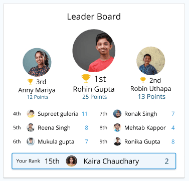
Leaderboard: added this to encourage friendly competition among students. It keeps them motivated and makes learning feel more rewarding and fun.

Simple Bar Chart: Introduced to help kids easily see their strong and weak areas at a glance. It’s a quick visual way for them to track their progress and stay focused.
Reflection
Learing
This project provided valuable insights into designing for younger audiences, helping me understand how to balance fun and functionality while keeping the user experience engaging.
Key learnings:
The importance of using vibrant colors and playful visuals to keep younger users engaged.
How gamification elements like leaderboards and rewards can motivate students.
The need for simple, intuitive designs that make complex data easy to understand.
The value of personalization and customization in enhancing the learning experience.