Highlights
Project Overview
This case study is all about redesigning the Indigo airline app. My motivation started with my own experience using the app and the numerous reviews I read, which mentioned that it looked outdated and was tough to navigate. I wanted to give the app a fresh, modern look while making it easier for everyone to use. My main focus was on simplifying the booking process, enhancing the visual design, and creating a smoother overall experience for users.
Challenge
The biggest challenge was achieving a modern design while preserving Indigo’s brand identity, making sure the app felt familiar.
Opportunity
I saw a chance to improve the app’s appearance and make the app more modern and enjoyable for users.
Timeline
Disciplines
Responsibilities
Tools
Skip to Designs
Background
Why Redesign Indigo?
Redesigning the Indigo app was crucial to meet user needs. Many users found the app outdated and hard to navigate, which led to frustration during the booking process. By addressing these issues, I aimed to create a more enjoyable and efficient experience for users
Key reasons for redesign
Outdated Design: The app's appearance was no longer fresh.
Confusing Navigation: Users struggled to find key features
Slow Booking Process: Completing bookings took longer than expected.
Poor User Ratings: Many reviews pointed out frustration with the app’s usability, leading to low ratings that impacted customer trust.
The Need for Change
It was clear the app needed a fresh start. My goal was to make it more user-friendly, modern, and functional. I focused on
A fresh, clean look to engage users.
Simplifying the booking process for a smoother experience.
Maintaining Indigo’s brand identity while updating the design.
This redesign wasn’t just about how the app looked but about making the overall user experience easier and more enjoyable.
My Process
1
Research
Desk Research
Competitive Analysis
2
Synthesis
Persona
Problem Identification
3
Ideation
Design Sketches
Low Fidelity
4
Final Designs
High Fidelity
Major Improvements
5
Reflection
Thoughts
Learning
Research
Desk Research
I took some time to look into what other airline apps are doing and what users are saying about them. I also read reviews of the existing Indigo app on the Play Store to get a sense of user frustrations and expectations. This research helped me spot where the Indigo app was missing the mark and where it could improve.
Findings:
Users found the app outdated and not very appealing.
The app's slow performance frustrated many people.
Competitors had easy-to-use navigation that made booking flights simple.
Users wanted a faster and smoother experience with fewer steps to complete their bookings.
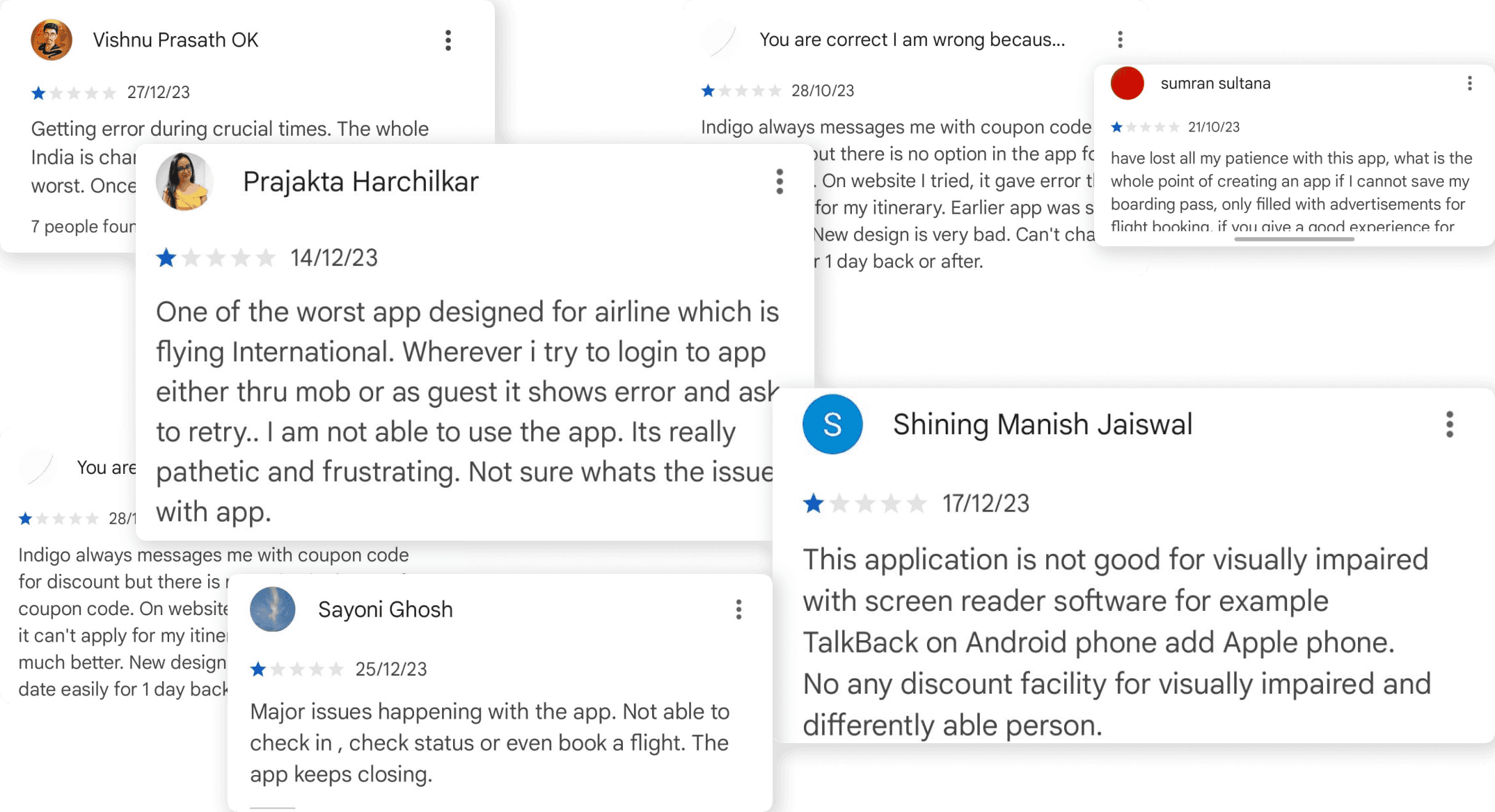

These insights helped me see what changes were needed to make the Indigo app more user-friendly and up-to-date
Competitor Analysis
To see how other airline and travel apps are meeting user needs, I took a close look at some competitors. This analysis helped me find features and design ideas that could really boost the Indigo airline app. I focused on two main competitors: MakeMyTrip and Ryanair. Both of these apps offered smoother user experiences and more modern looks, giving me great insights for the redesign.
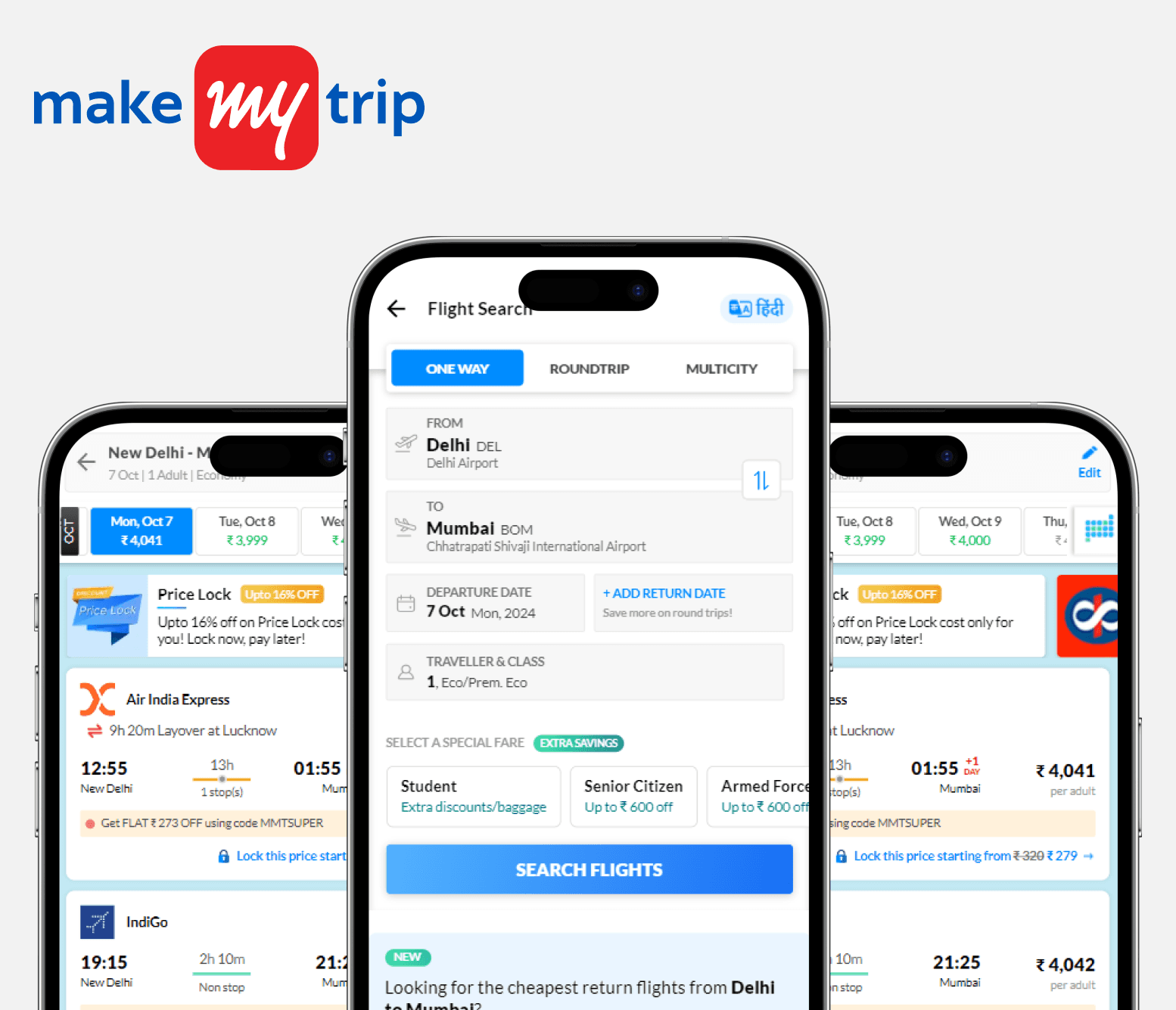
Clear and intuitive navigation
Fast loading times
Visually appealing, modern UI
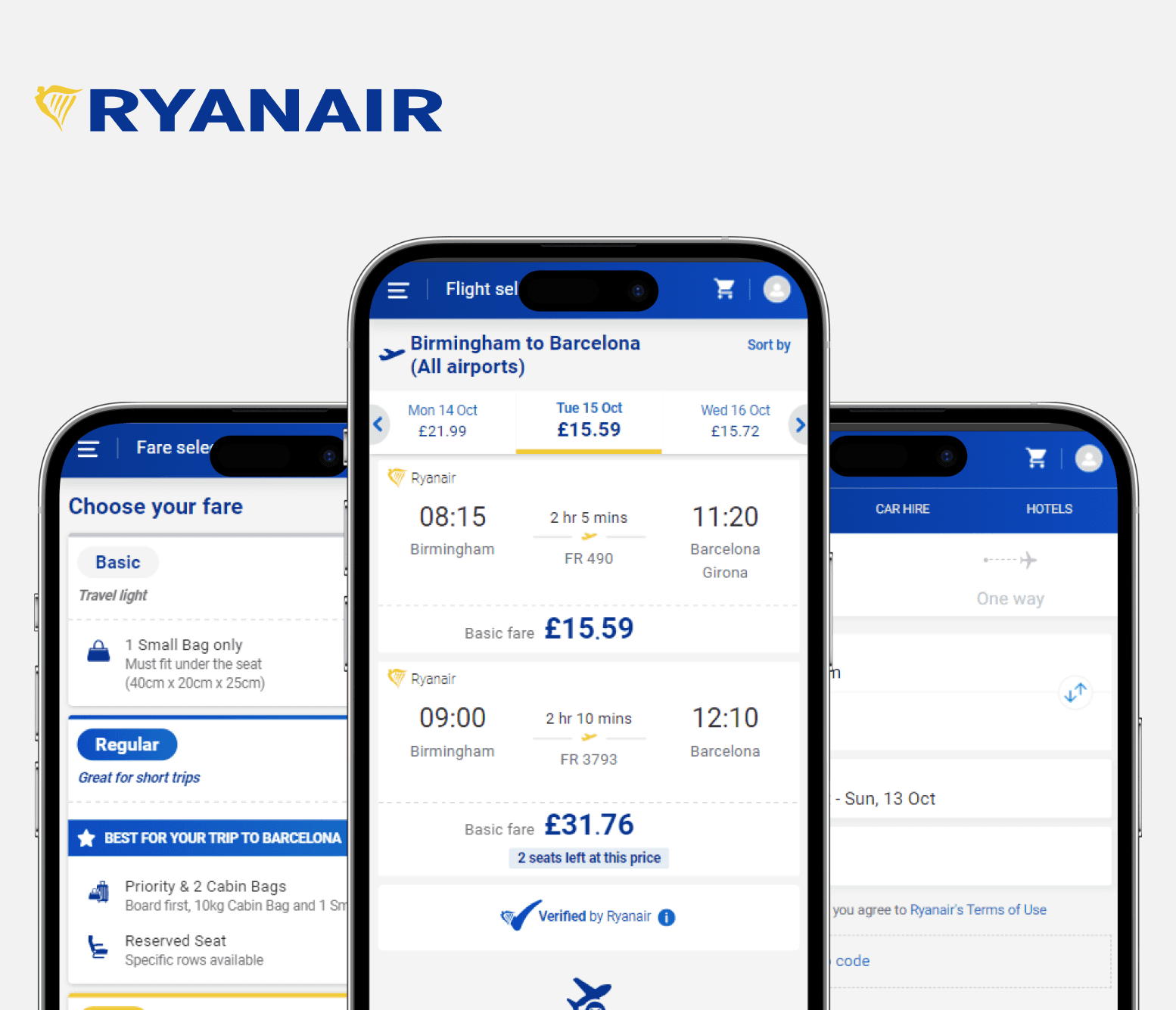
Streamlined booking process
Simple, user-friendly layout
Effective use of minimalistic design
Synthesis
Persona
To understand who the typical Indigo app user is, I created a user persona that represents the core audience. The app mainly serves young professionals and frequent travelers who are part of the Indigo 6E loyalty program. These users care about speed, efficiency, and having a modern design in the tools they use. Most of them are tech-savvy and expect a smooth booking experience without any hassles. They’re usually between 25 and 35 years old and are used to navigating digital platforms for their travel needs.

Problem Identification
After digging into my research and creating user personas, it became clear that the Indigo app needed two big changes: updating the outdated UI and making navigation easier. These were the main pain points for users, and fixing them was essential for the redesign
key Changes identified:
Outdated Design:
The app's old design didn’t have the modern look that users expect. It felt cluttered and didn’t invite engagement. Tech-savvy users wanted something sleek, intuitive, and visually appealing. The redesign needed to capture a fresh, modern style while keeping Indigo’s brand identity intact.
Navigation Challenges:
Users often had trouble finding key features like booking options and flight details because the navigation was confusing. The layout didn’t make sense, and completing even simple tasks took too many steps. Streamlining the navigation and making the user journey smoother became key goals for the redesign.

With these changes in mind, I was ready to jump into the design process and start making improvements.
Ideation
Design Sketches
I began with some quick sketches to get a feel for the design and explore different ideas. It helped me figure out the basic layout and identify what features to focus on.

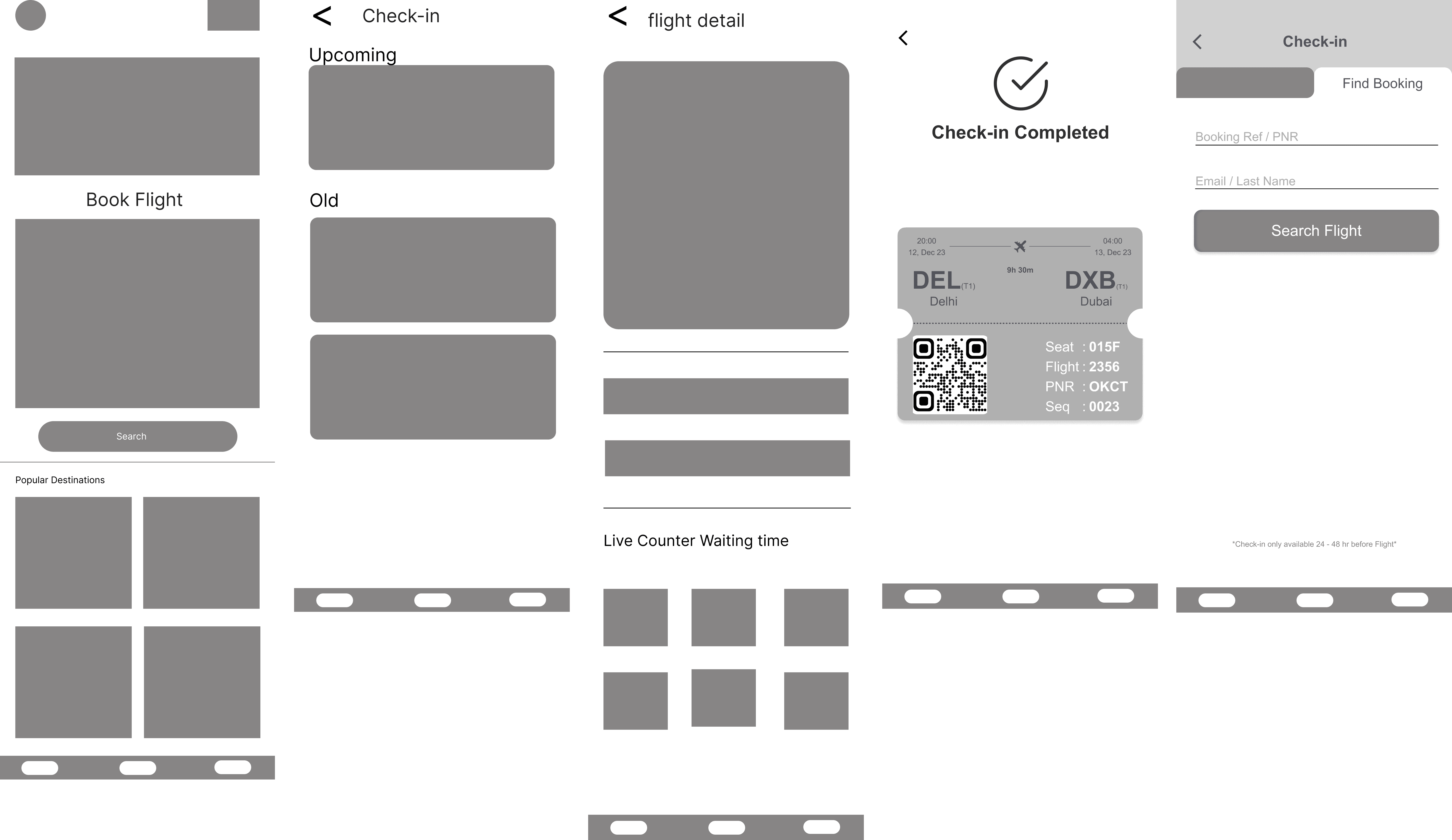
Low Fidelity
Next, I moved on to creating low-fidelity wireframes in Figma. These were more detailed than the initial sketches and helped visualize the basic structure and flow of the app, setting the foundation for the design.
Final Designs
High Fidelity
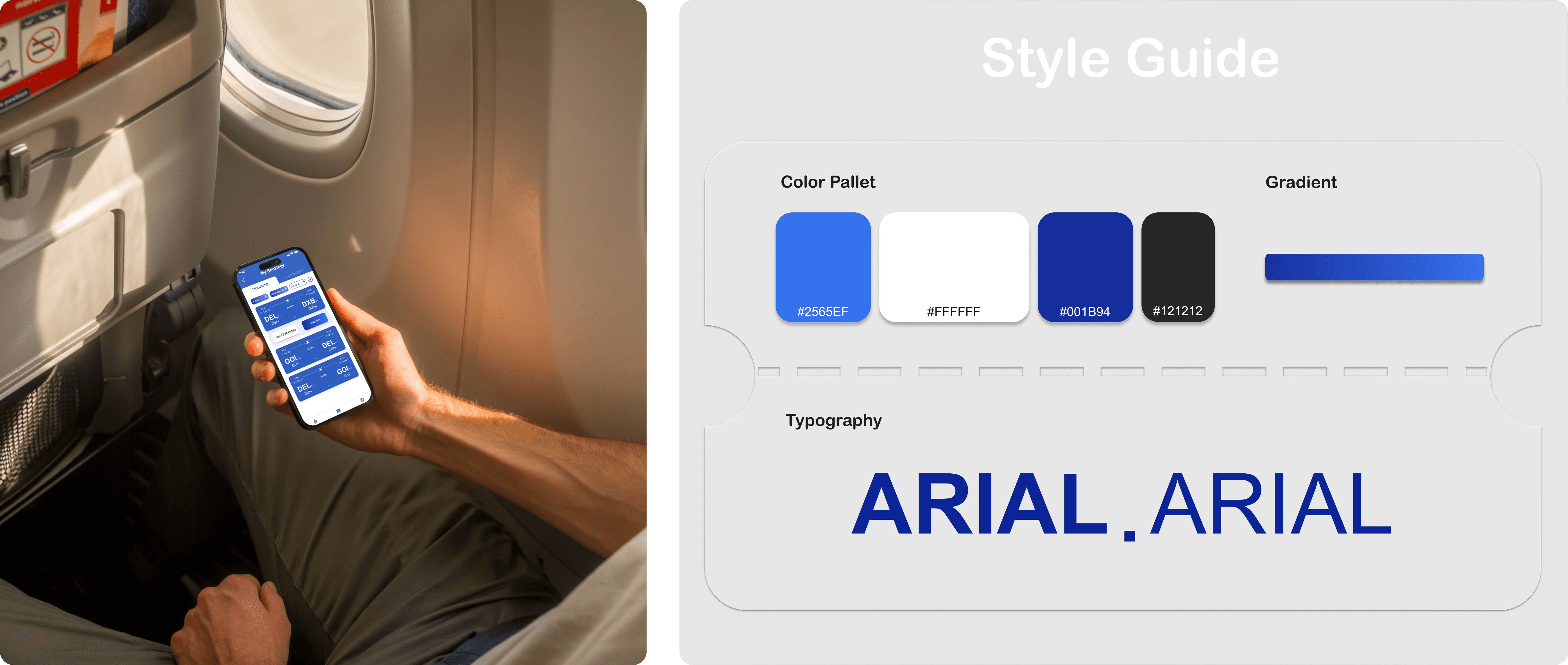
With the structure in place, I moved on to high-fidelity designs to bring the app's look and feel to life. This step focused on refining the visual style, adding colors, typography, and interactive elements to create a polished and engaging user experience.

Major Improvements
I focused on key areas that would have the biggest impact on the user experience. While I redesigned multiple screens with a fresh UI, these are the few that made the most significant difference in enhancing user experience.
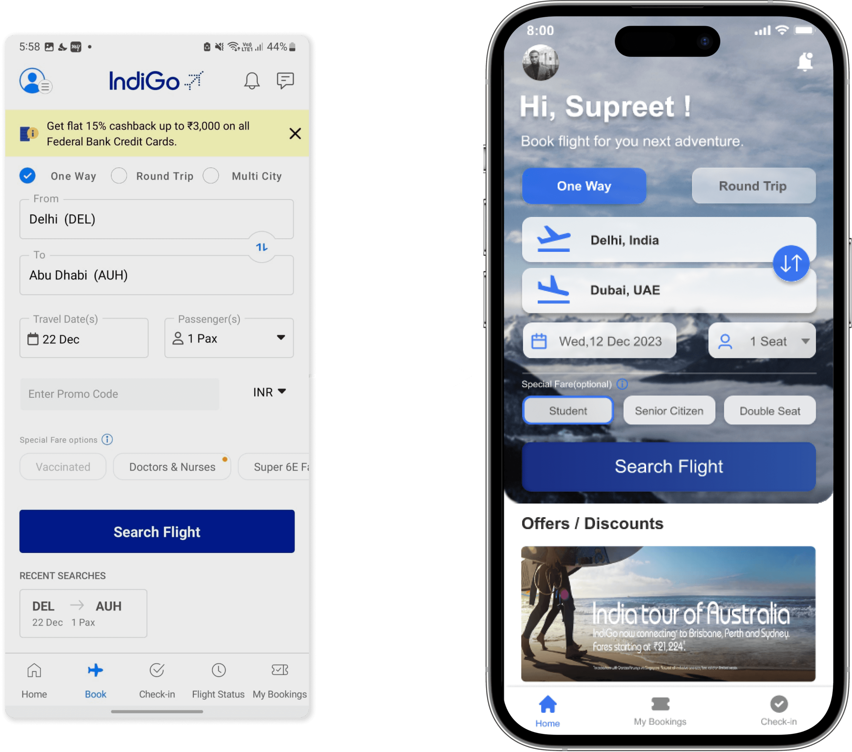
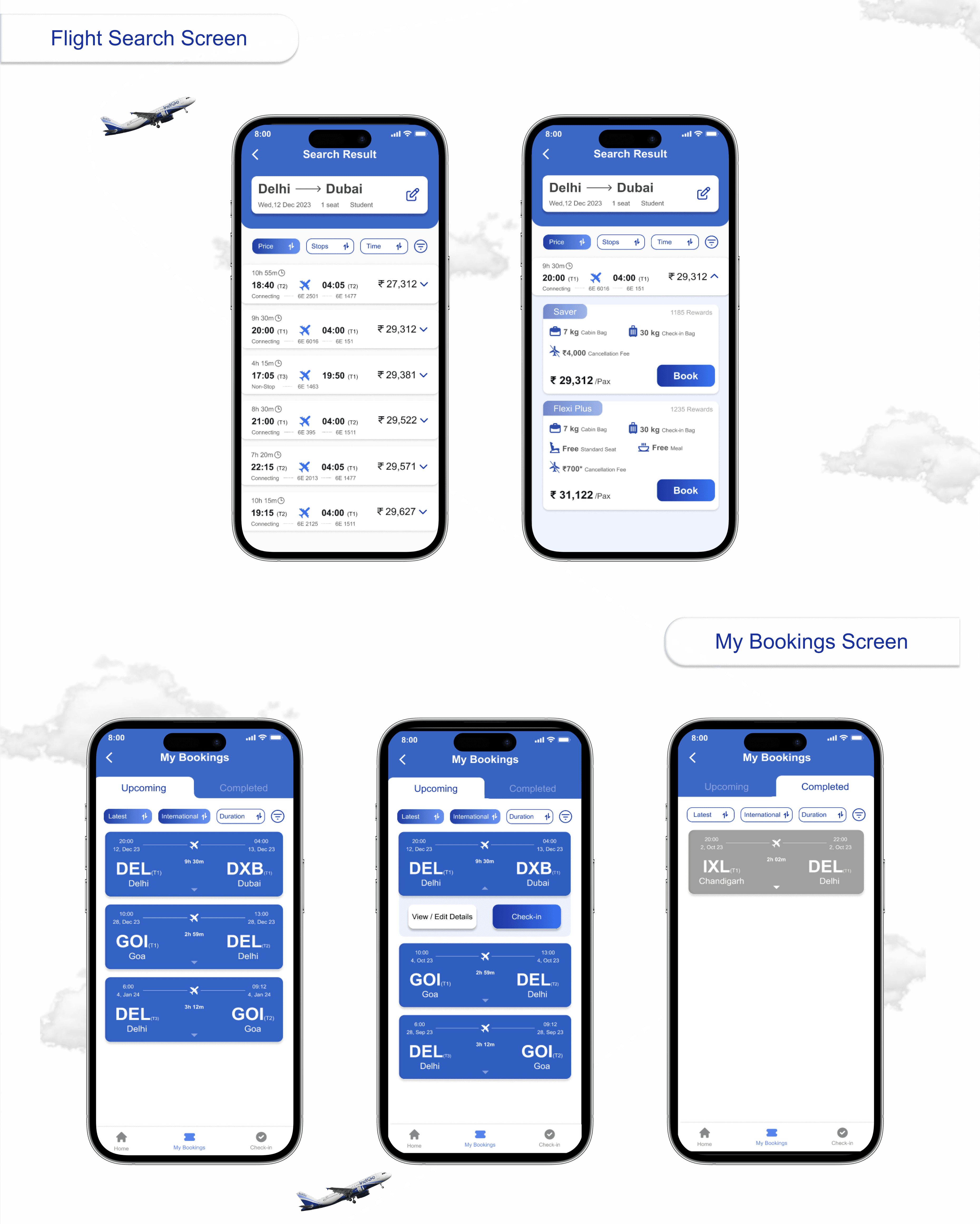
home screen was redesigned with a more intuitive and visually appealing UI, incorporating engaging graphic elements.
The flight search interface was enhanced
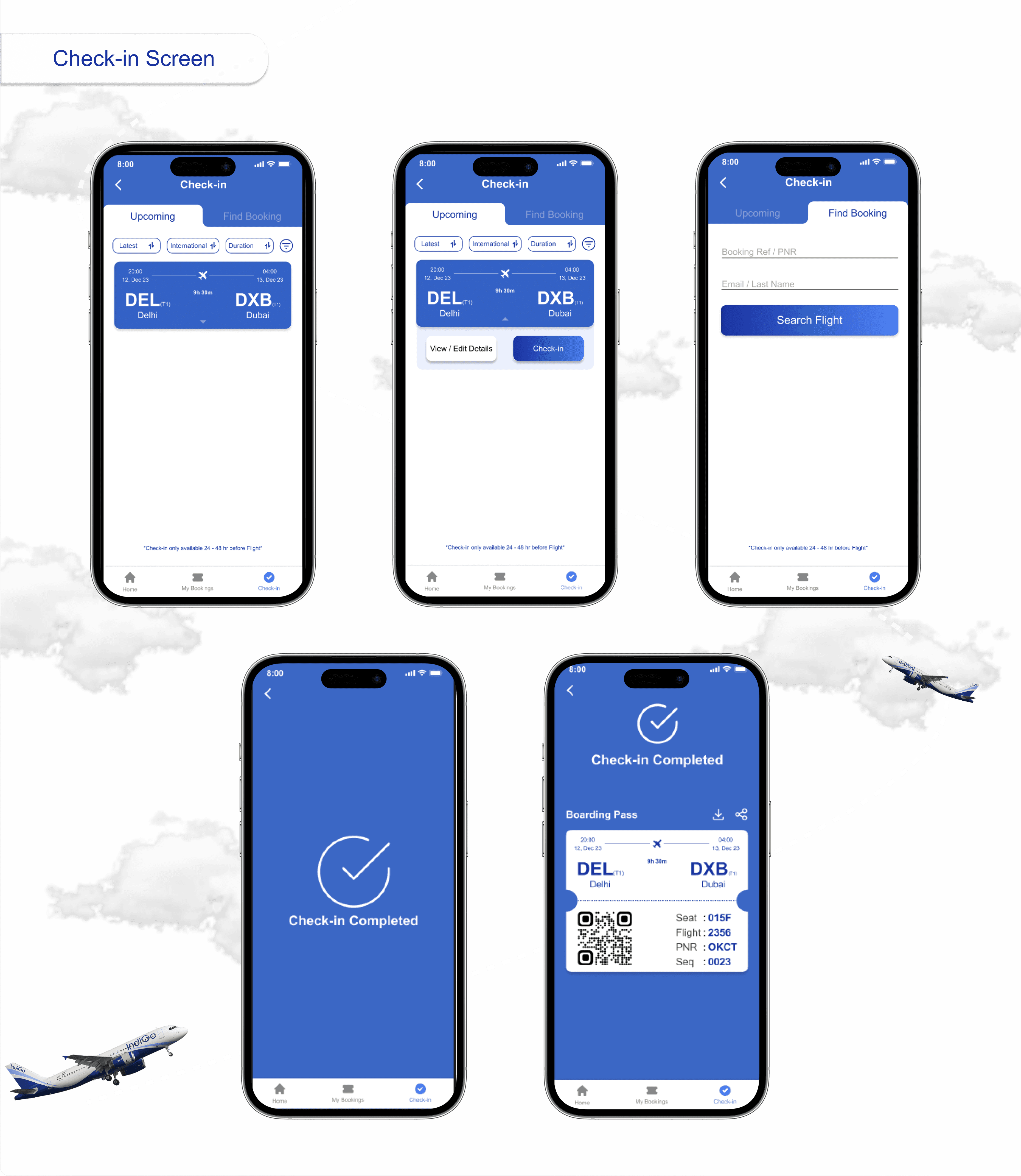
Easy navigation options were added at the bottom to improve overall accessibility.
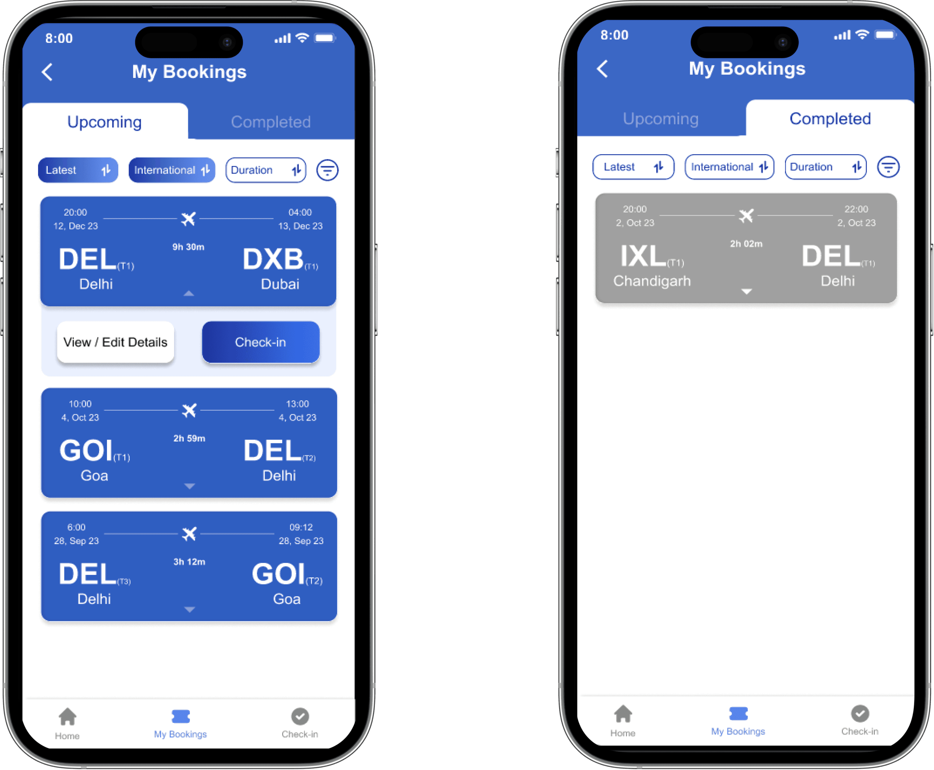
Updated the booking card design for a modern, sleek look.
Provided quick access to view booking details or complete check-ins.
Added easy navigation to view past and upcoming bookings.
Reflection
Thoughts
Redesigning the Indigo app was a challenging yet rewarding journey. I felt the excitement of bringing a fresh look to the app while staying true to its brand. It was a great learning experience that pushed me to think creatively and stay user-focused.
I discovered how crucial it is to balance modern design with maintaining a familiar feel.
Realized the impact of small design changes in making navigation smoother and more intuitive.